SELECTED WORK / BRAND IDENTITYROLL & DIP · EGYPT

A little warmth.
A world of indulgence.

EXPLORE THE STORY ↓
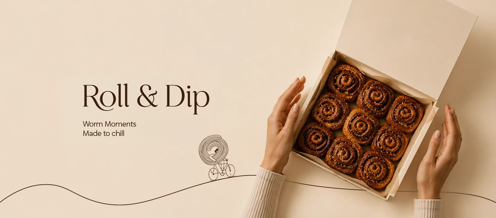
Roll & Dip packaging and cinnamon rolls on a warm cream background
01 / The brand

Made to feel
like your favourite place.

Roll & Dip is an Egyptian bakery and café centred on cinnamon rolls. The project brought together naming, strategy, visual identity and social design, with a warm, refined character inspired by the atmosphere of Parisian streets.

روول اند دييب مخبز وكافيه مصري متخصص في السينابون. بنينا له شخصية تجمع دفء المخبوزات وأناقة المقاهي، من الاسم والاستراتيجية لحد الهوية والتغليف وشكل السوشيال ميديا.

SCOPE
Naming · Strategy · Visual identity
Packaging · Social media design
CONTEXT
Egypt · Bakery & café
Project duration: two months
02 / Visual identity

Quietly distinctive.

An expressive wordmark, warm neutrals and a deep burgundy accent form a recognisable visual language.

The supplied Roll & Dip white wordmark
Cream#F7F1E8
Espresso#3A1F0D
Deep burgundy#2D070B
03 / Social expression

You can almost
taste the warmth.

Rich textures, intimate framing and considered typography carry the same character into the feed. Selected published designs.

01 / CINNAMON ROLL1080 × 1350
02 / WARM MOMENTS1080 × 1350
04 / Beyond the screen

A world you
can hold.

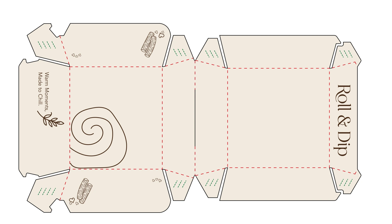
The identity extends into packaging through the wordmark, hand-drawn food illustrations and a warm cream base.

Original box packaging artwork with print dielinesBOX PACKAGING / ORIGINAL PRODUCTION ARTWORK
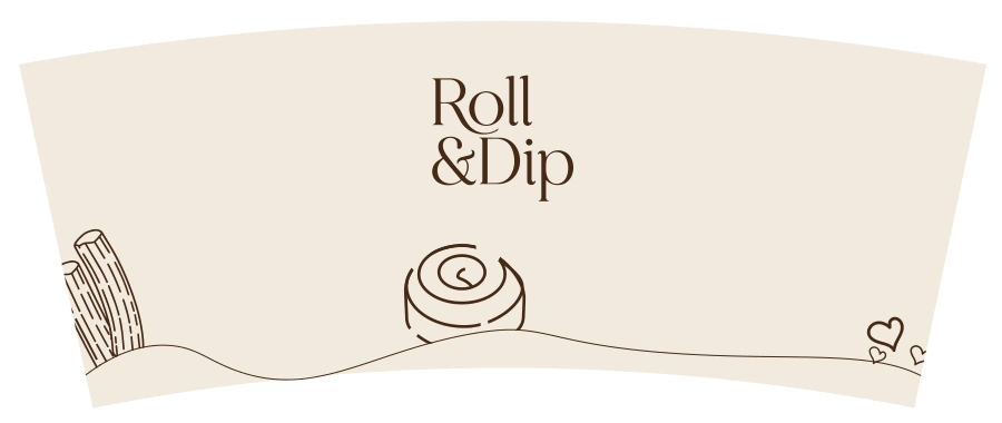
Original cup sleeve artwork with Roll and Dip logo and food illustrationsCUP ARTWORK / ORIGINAL FLAT DESIGN
Roll & Dip / Brand world

Warm moments.
Made to chill.

CREATIVE CREDIT
Omdastudios
Strategy · Naming · Identity · Packaging · Social design

Photography excluded from studio scope.
Presentation study / October 2026

BACK TO TOP ↑